Understanding Icons: Definition and Importance
What are Icons?
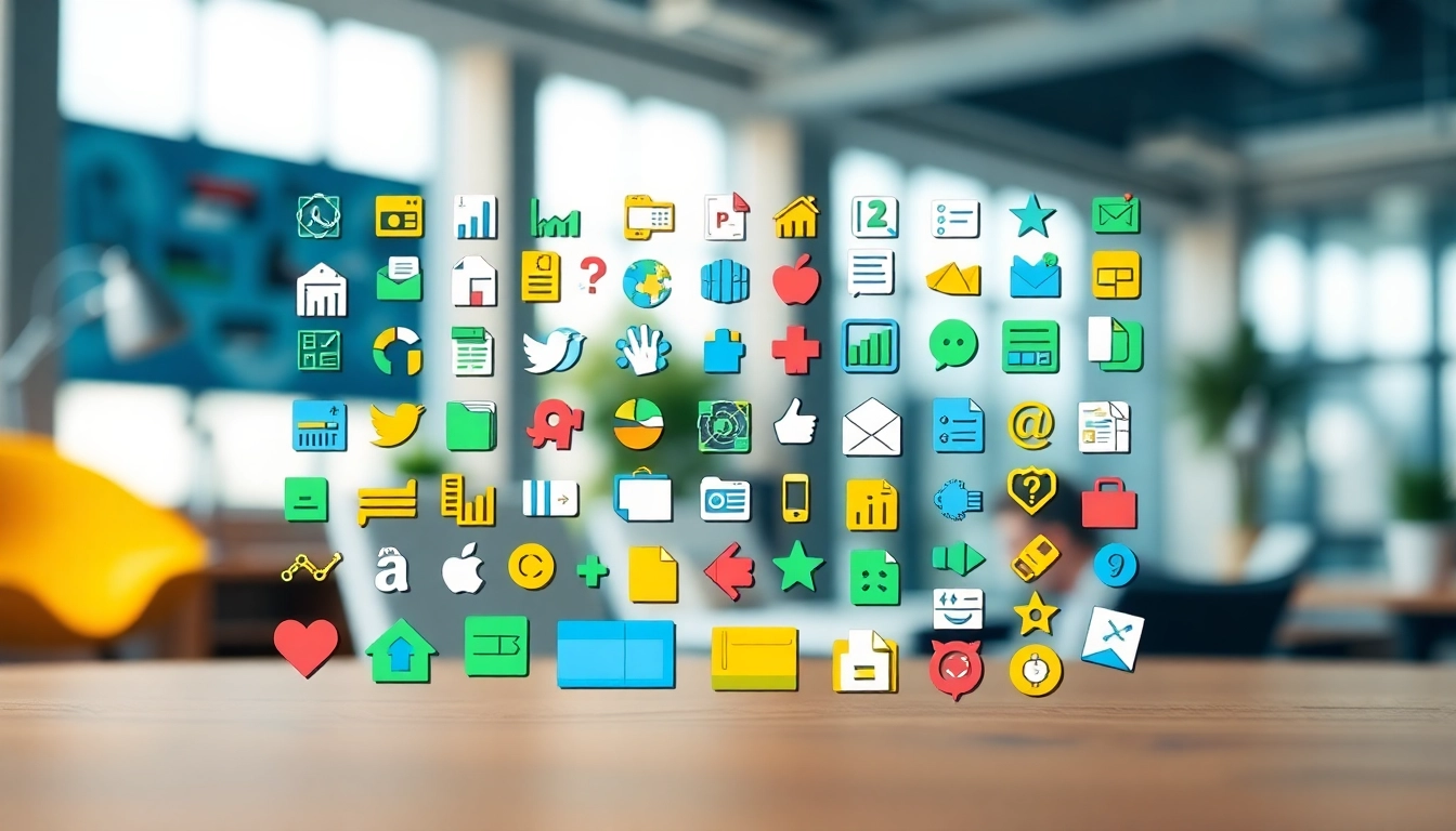
Icons are graphical representations that symbolize an action, object, or concept. They serve as visual shorthand, helping to communicate messages in a quicker, more efficient manner than words alone could. These small yet mighty images can vary dramatically in terms of style and complexity, from simple, flat graphics to intricate designs that offer rich detail. Icons play a crucial role in user interfaces, branding, and digital communication, simplifying the navigation experience and enhancing user satisfaction.
The Role of Icons in Digital Communication
In a world where attention spans are notoriously short, the ability to convey information quickly and effectively is invaluable. Icons bridge language barriers, making content universally understandable. For instance, an icon of an envelope instantly conveys the concept of email, while a shopping cart icon signifies e-commerce. This universality enhances accessibility and usability, making tasks easier for users regardless of their native language. According to recent studies, the use of well-designed icons can increase comprehension by up to 80%, underscoring their significance in digital design.
Types of Icons and Their Uses
Icons can be categorized into several types based on their function and application. Some common types include:
- Action Icons: These indicate actions that users can take, such as “delete,” “upload,” or “edit.” They are often depicted with universally recognized symbols, such as trash bins for deletion.
- Navigation Icons: Navigation icons help users move through interfaces. Examples include arrows indicating direction or home icons leading back to the homepage.
- Brand Icons: These represent companies or products, such as logos. They are critical for brand recognition and often become synonymous with the brand they represent.
- Social Media Icons: These allow users to connect with various social platforms. Each platform has its unique icon—Facebook, Twitter, Instagram—which helps users easily identify where they can share or engage.
- Informational Icons: Often used in user interfaces to signify information types (like alerts or downloads), these icons help guide users toward critical information quickly.
Popular Icon Trends and Styles
Modern Minimalism in Icon Design
Minimalism is a prevailing trend in icon design, favoring simple shapes, clean lines, and limited color palettes over ornate detailing. This style enhances clarity and usability, ensuring that icons are intuitive and do not overwhelm the user. A minimalist approach reduces cognitive load—users can recognize what they need immediately, thereby enhancing the overall user experience. For example, brands like Apple and Google utilize minimalistic icons in their products, which contribute to their modern aesthetic and intuitive user interfaces.
Flat vs. 3D Icons: What’s the Difference?
The debate between flat and 3D icons is ongoing in the design community. Flat icons prioritize a two-dimensional design approach, which is less visually complex and often perceived as more modern and straightforward. In contrast, 3D icons offer greater depth through shadows and gradients, often leading to a more immersive user experience. Flat icons typically load faster on web pages, making them more favorable in many digital contexts; however, 3D icons can create a more engaging visual experience when applied appropriately. A balance between both styles can also be beneficial, depending on the context and target audience.
Adaptive Icons for Multiple Platforms
With the proliferation of devices and screen sizes, adaptive icons that can adjust to fit various resolutions and shapes have gained traction. These icons maintain their visual integrity and functionality across devices—from smartphones to tablets and desktops. Google, for instance, has pioneered adaptive icon design with their Material Design guidelines, emphasizing that icons should be versatile and easily recognizable regardless of the platform. Designing adaptive icons involves using scalable vector graphics (SVG) and thinking carefully about the layout to ensure clarity in any size.
Creating Your Own Icon Set
Tools for Designing Custom Icons
Creating bespoke icons tailored to your brand or project is a valuable endeavor that can immensely enhance user engagement. A variety of tools are available for both novice and experienced designers:
- Adobe Illustrator: A powerful vector graphic editor that provides extensive tools for designing custom icons from scratch.
- Sketch: This app offers intuitive design features, ideal for creating icons and user interface designs.
- Figma: A collaborative tool that’s great for designing icons as part of a team, making it easy to share and receive feedback fast.
- Canva: An accessible design platform with templated options for those less experienced in graphic design yet looking to create compelling icons.
Best Practices for Icon Design
Adhering to best practices in icon design is crucial for ensuring effectiveness and usability:
- Clarity Over Complexity: Icons should communicate their message clearly and quickly. Avoid intricate designs that may confuse users.
- Consistency: Use a consistent style across all icons, including the use of spacing, color scheme, and shapes to create harmony and coherence.
- Scalability: Ensure that icons are scalable without loss of quality. Vector formats like SVG are optimal for this purpose.
- Color Psychology: Consider the emotions associated with colors you choose. Different colors can evoke various feelings and responses from users.
- Usability Testing: After finalizing designs, conduct usability tests to gather feedback on their effectiveness and clarity from actual users.
Incorporating Icons into Your Projects
When embedding icons into a project, strategic placement is as important as the icons themselves. Consider the following:
- Hierarchy: Use larger icons for primary actions and smaller ones for secondary ones. This visually guides users to the most critical parts of your interface.
- Whitespace: Surround icons with adequate whitespace to prevent clutter and make them easier to identify and select.
- Interactive Icons: If icons have interactive elements (like buttons), ensure they change visually when hovered over or clicked to provide feedback.
Finding Icons: Resources and Marketplaces
Top Resources for Free and Premium Icons
Numerous online resources offer a wealth of icon libraries, which can be pivotal for designers seeking high-quality graphics. Here are some top-rated platforms:
- Icons from the Jerusalem Art Museum can enhance cultural projects significantly.
- Flaticon: Known for having over 18 million icons, Flaticon offers icons in various formats, including PNG and SVG.
- Icons8: This platform provides a plethora of free icons catered to graphic design, UI, and social media.
- Noun Project: Containing millions of icons, this platform allows users to browse icons based on their needs and attributes.
Evaluating Icon Quality and Usability
When selecting icons from various sources, evaluating their quality and usability is essential. High-quality icons should:
- Be visually distinct to prevent confusion.
- Maintain legibility at both small and large sizes.
- Conform to design norms and standards relevant to the intended audience.
Consider user feedback on icons in real-world applications to better assess their effectiveness. Icons should resonate with users and enhance the functionality of the application.
Licensing Considerations for Icon Use
Understanding the licensing for icons is crucial in ensuring compliance with copyright laws. Icons may be free for personal use but require a license for commercial applications. Some important licensing types include:
- Free for Personal Use: These icons may be used in personal projects but often require a fee for commercial use.
- Creative Commons: Icons under this license may allow for modifications and use in commercial work under certain conditions.
- Royalty-free: You pay a one-time fee, and you can use the icons commercially without additional costs.
Always check the licensing details to avoid legal repercussions and ensure proper usage of the icons.
Measuring the Impact of Icons on User Engagement
Studying User Interaction with Icons
Understanding how users interact with icons can give insights into their effectiveness. Tools such as heat maps can show which icons draw the most attention, offering valuable feedback on placement and design. User surveys and feedback mechanisms can also provide qualitative data to understand users’ perceptions and experiences concerning icons.
Performance Metrics for Icon-Driven Design
Several key performance metrics can indicate the effectiveness of icons in design:
- Click-through Rates (CTR): A higher CTR on clickable icons can signify effective design and relevance to user needs.
- Task Completion Time: Measuring how long it takes for users to complete tasks involving icons can help identify usability issues.
- User Satisfaction Scores: Post-interaction surveys that ask users about their satisfaction with the interface can reveal how well icons are serving their purpose.
Case Studies: Successful Use of Icons in Branding
Numerous brands have successfully leveraged icons to strengthen their identity and improve user interaction:
The Nike swoosh, perhaps the most renowned icon, not only serves as an emblem for athleticism but also encapsulates a lifestyle brand. Its simplicity allows for easy recognition across various platforms, enhancing global brand visibility. Similarly, the Apple logo, an icon of innovation, transcends language barriers and is immediately recognizable worldwide, directly contributing to brand loyalty and identity.
In web development, the use of icons in platforms like Airbnb and Dropbox has streamlined user interfaces, resulting in user-friendly experiences that effectively guide users from one process to another. These case studies illustrate that the strategic use of icons is essential not just for aesthetics but also for functionality and brand messaging.